Why Portfolio Architecture Makes or Breaks the Experience
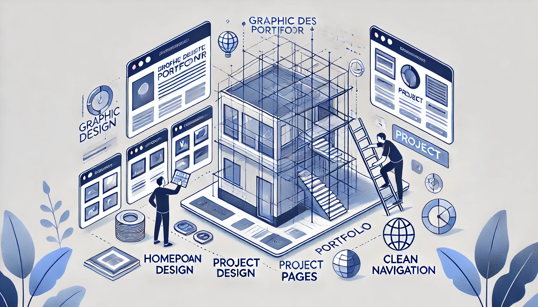
Most graphic designers obsess over visuals colors, type, and animations. But what often gets overlooked is the invisible scaffolding that holds the entire experience together: information architecture.
Great design is guided by smart structure. A great graphic design portfolio site isn’t just beautiful it’s easy to navigate, logical to explore, and built for user intent.
In this guide, I’ll walk you through the entire portfolio structure, section by section. From homepage to project page to contact, you’ll learn exactly what goes where, and why.

The Purpose of Portfolio Architecture
Let’s be clear: this isn’t about wireframes for wireframes’ sake.
It’s about:
- Creating an intuitive user flow
- Helping clients and employers find what they need fast
- Guiding them through your story without friction
- Increasing contact/conversion rates
- Making your portfolio scalable, update-friendly, and SEO-ready
The best graphic designer portfolio websites aren’t flashy. They’re intentional.
Suggested Posts:
• Technical SEO vs On-Page SEO
• SEO Packages Pricing Models
• SEO Pricing Guide
Section-by-Section Breakdown: UX Architecture in Motion
The Homepage – Set the Tone Instantly
This is your digital front door. In 3 seconds or less, a visitor should know:
- Who you are
- What you do
- What kind of work you’re best at
- How to explore further
Must-haves:
- Short headline with clarity (“Brand + Web Designer for SaaS”)
- Visual teaser (hero image, looping reel, or featured project)
- CTA button (“View Work” or “Scroll to Projects”)
- Clear nav bar that remains visible (sticky nav is best practice)
This isn’t a résumé. It’s a positioning tool.
The About Section – Human, Not Hollow
Once users are intrigued, they’ll want to know who they’re dealing with. This page should feel more like a coffee intro than a résumé.
Goals:
- Share your story, not just your skillset
- Show your process, influences, or creative philosophy
- Build emotional resonance, not just credentials
Structure it like a conversation. Include a photo. Link to your resume or LinkedIn. Consider a modular layout with visual breaks to keep it digestible.
The Portfolio Index – Work, Curated With Purpose
Think of this as your gallery wall. It should be modular, clean, filterable if needed, and reflect your brand.
Key practices:
- Show 5–7 strong projects, not 20 filler ones
- Use preview thumbnails that match your tone
- Add rollover effects or animated previews for energy
- Keep the layout consistent: columns, gutters, and spacing matter
This is the page most visitors will scan fast make it visually scannable and story-linked.
Suggested Posts:
• Best SEO Audit Service
• Website SEO Audit Guide
• Fix SEO Issues with Audit
The Project Page – Tell the Whole Story
Here’s where the real persuasion happens.
Each project should include:
- The brief/problem
- Your role and tools used
- Process breakdown (sketches, iterations, decisions)
- Final outcome (screenshots, video, results)
- Reflection or lessons (optional but powerful)
Scroll depth design is key here—use full-bleed visuals, consistent typography, and sticky menus if the case studies are long.
The Contact Page – The Invite That Converts
This is not a form. It’s a close.
Key UX features:
- A short intro or thanks (“Let’s build something together.”)
- Contact form with minimal fields
- Direct email link
- Optionally: Calendly link for discovery calls
- Secondary CTA: resume, LinkedIn, Behance
Anchor this in the footer CTA of every page. Never make people dig for how to reach you.

How It All Comes Together: UX Flow
Here’s the typical user journey on a well-built graphic designer web portfolio:
- Land on the homepage → get curious
- Click “View Projects” → land on Portfolio Index
- Browse project thumbnails → click a standout
- Scroll case study → impressed → CTA at bottom
- Click Contact → fill form or email
Every interaction should feel like a soft “yes” leading to the next.
Tip: Use modular layout patterns across pages for rhythm—same button styles, same header logic, same page transitions.
Navigation Best Practices
Your navbar should:
- Be sticky (stay visible while scrolling)
- Include only 3–5 items: Work, About, Contact, maybe Blog or Resume
- Never hide critical info in dropdowns
- Work flawlessly on mobile (hamburger menu should open full-screen)
Your footer CTA should:
- Always repeat the main action (“Let’s talk” or “Start a project”)
- Link directly to your form or booking tool
- Include minimal social icons (no clutter)
The goal? Never leave your user stranded.
Key Takeaways
A successful graphic designer website portfolio isn’t built on aesthetics alone. It’s built on logic, hierarchy, and empathy.
You’re not just showing what you’ve done. You’re guiding someone to trust you enough to reach out.
The sites that convert best use information architecture as an invisible selling tool clarifying each page, minimizing friction, and turning interest into opportunity.
- Strong portfolio-architecture creates flow, not confusion
- Every section has a job: draw, inform, persuade, convert
- Modular layout and sticky nav make UX feel effortless
- Case studies must be deep, visual, and story-driven
- CTA placement and structure matter as much as your work
FAQs
How many pages should a graphic designer portfolio have?
Five is ideal: Home, About, Portfolio, Project (dynamic), and Contact. Add Blog or Resume as needed.
Should I use one-page or multi-page layouts?
One page works for minimal portfolios, but multi-page gives you more SEO and content flexibility.
Is navigation hierarchy important for small sites?
Yes. Even with 3 pages, order matters. Lead with “Work,” not “About.” CTA should be visible early.
What’s the biggest architectural mistake?
Missing or buried CTAs, inconsistent layout logic, or visual overload with no hierarchy.
