Introduction
In today’s digital world, your gym’s website is often the first touchpoint with potential members. Whether it’s a visitor looking for class schedules, membership details, or a tour of your facilities, the website needs to convey trust, professionalism, and value from the very first click. But how do you build a gym website that stands out from the competition?
One of the most effective ways to create an impactful website for your gym is by looking at gym website examples that have already succeeded. By studying top-performing websites, you can extract design elements, functionality, and content strategies that resonate with visitors and help convert them into members. We’ll explore some of the best gym website examples, discuss what makes them successful, and offer insights into how you can apply these lessons to your website.

Related Posts
The Role of Examples in Inspiring a Gym’s Website Design
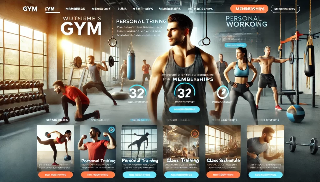
Successful gym websites don’t happen by accident. They’re the result of strategic design, user-focused content, and intuitive navigation. Looking at gym website examples can provide you with the inspiration and practical knowledge you need to craft your own gym’s online presence. These examples demonstrate the power of clear calls-to-action (CTAs), mobile-friendly layouts, strong visual design, and seamless user experience. By studying successful gym websites, you can avoid common pitfalls and understand how different design elements and features enhance the overall user experience.
How Studying Successful Websites Can Help Shape Your Own
Taking inspiration from the best gym website examples allows you to visualize how your site might look, feel, and function. Whether it’s the bold use of typography or an innovative class booking system, each website has a unique approach to achieving business goals. These examples offer real-world proof of what works in gym web design and what doesn’t.
By breaking down successful websites, you can better understand how to:
- Create a strong first impression with visitors.
- Ensure your website is responsive and mobile-friendly.
- Implement user-centric navigation that makes booking and browsing easy.
- Integrate functional elements, such as class schedules, member portals, and payment systems.
Top Gym Website Examples
Here’s a curated list of gym website examples that not only excel in design but also prioritize user experience and functionality. By examining each site’s unique features, you can learn key lessons for your website.
Example 1: Barry’s Bootcamp
Design Features: Barry’s Bootcamp’s website exudes energy with bold typography, vibrant imagery, and a simple, engaging layout. The website’s design reflects the brand’s energetic and motivational approach to fitness. The homepage features a clear CTA to book classes, ensuring the user is prompted to take immediate action.
What Makes It Stand Out: Barry’s uses high-quality images to convey the intensity of its classes, reinforcing the brand’s identity. The site is designed for easy navigation, with minimal distractions, making the booking process seamless. The use of large, colorful call-to-action buttons encourages visitors to sign up for classes.
Example 2: Equinox
Design Features: Equinox’s website blends sleek, modern design with functionality. It uses a minimal color palette, high-definition visuals, and large, clean fonts that make it easy for users to read. The homepage features a video background that showcases the atmosphere of the gym, making it feel dynamic and immersive.
What Makes It Stand Out: Equinox’s site offers personalized experiences, including location-based gym finder tools and interactive class schedules. The site is user-friendly and features a comprehensive membership portal where users can manage their accounts and book services effortlessly.
Example 3: Gold’s Gym
Design Features: Gold’s Gym website focuses on showcasing its extensive facilities and class offerings. The layout is simple and intuitive, with large images that allow users to visually explore the gym’s offerings. The homepage is designed for easy navigation, highlighting essential services such as memberships, personal training, and group classes.
What Makes It Stand Out: Gold’s Gym includes an easily accessible blog section that provides fitness tips and success stories, helping to establish authority in the fitness space. Their design is optimized for local search, allowing visitors to find their nearest gym location quickly.
Example 4: SoulCycle
Design Features: SoulCycle’s website stands out with its clean design and impactful imagery. The site uses large photos that show the community vibe at SoulCycle studios. The homepage includes a strong call to action—”Reserve a bike”—which directly leads users to the booking section.
What Makes It Stand Out: The site includes a seamless booking system where users can check class availability and book their spots in a few clicks. The intuitive user interface ensures that visitors don’t get lost in complex navigation paths, making it easy for them to focus on booking their next class.
Example 5: ClassPass
Design Features: ClassPass is a fitness membership service that features a highly functional website with an interactive layout. The homepage is direct and action-oriented, featuring simple CTAs like “Sign up for free” and “Browse classes.”
What Makes It Stand Out: ClassPass’s website allows users to quickly view available fitness classes and gyms in their area. The clean design and intuitive navigation make it easy for potential users to explore gym memberships, find available classes, and read user reviews—all from one platform.

Related Posts
What You Can Learn from These Gym Websites
Each of the gym website examples above shares certain characteristics that help create a positive user experience and encourage conversions. Here are some of the key elements you can incorporate into your own website.
Design Inspiration – Layouts, Color Schemes, Typography
The design of your gym’s website should align with your brand’s identity. For instance, Barry’s Bootcamp uses bold typography and vibrant colors to create an energetic, motivational atmosphere, while Equinox uses sleek, minimalist design to evoke sophistication. Think about your gym’s brand and select colors and fonts that match the tone you want to set for your visitors.
Functionality – Easy Navigation, Booking Systems, Member Portals
An intuitive user interface (UI) is a must. Whether it’s easy navigation that allows visitors to quickly find information or a seamless booking system for classes and memberships, functionality plays a major role in user satisfaction. Look at how sites like SoulCycle and Equinox implement simple, effective systems for booking and managing memberships.
Content Ideas – How to Present Services, Pricing, and Community Features
Content is the backbone of your gym website. Look at the way ClassPass highlights its service offerings with concise, informative descriptions, or how Gold’s Gym uses its blog to feature expert fitness content and member success stories. Your website should present your gym’s offerings, highlight your pricing structure, and feature testimonials or success stories from your community.
How to Choose the Right Features for Your Gym Website
When it comes to gym website features, the options can be overwhelming. Should you integrate a booking system? A blog? A member portal? Here’s how you can determine what’s right for your gym.
Matching Your Gym’s Services with the Right Web Features
The features you include should directly reflect your gym’s services and target audience. For example, if your gym offers high-intensity classes, you may want a booking system that shows class schedules and availability in real time. If your gym is focused on personal training, a detailed trainer bio section might be valuable.
User-Centric Design
A successful gym website places the needs of the user first. Look at the navigation flow of top gym websites like Equinox and Barry’s Bootcamp—users are always presented with options that make their visit to the site efficient and engaging. Prioritize ease of use to ensure that visitors can quickly find what they need.
Key Takeaways
Gym website examples can provide the inspiration and practical guidance needed to create an effective online presence for your business. Whether you’re focusing on bold design, user functionality, or engaging content, these real-world examples show you what works in the gym website world. By incorporating the best features of these sites, you can create a website that not only attracts visitors but also converts them into loyal members.
- Look to successful gym website examples for design inspiration, functionality, and content strategies.
- Focus on user experience, intuitive navigation, and seamless functionality.
- Consider incorporating features such as online booking systems, member portals, and blog content.
- Tailor your design to match your gym’s unique brand and services.
Looking at gym website examples provides invaluable insight into what makes a website truly effective. From bold designs and high-quality imagery to user-centric navigation and booking systems, the best gym websites offer something for every type of gym owner. By studying these examples, you can ensure that your own gym’s website is not only visually appealing but also functional and engaging. As you plan your gym website, take the time to analyze what works for these industry leaders, apply similar principles, and make them your own. Whether it’s enhancing the design, refining content strategies, or optimizing functionality, the key to a great gym website lies in providing visitors with the best possible user experience.
FAQs
Why are gym website examples important?
Studying successful gym website examples helps you understand what works in design, content, and functionality. It provides inspiration and practical tips for creating a high-performing site.
How can I make my gym website more engaging?
Focus on creating visually appealing content, offer a seamless user experience, and provide clear calls to action. Incorporate features like easy navigation, booking systems, and community testimonials.
What are the best design elements for a gym website?
Strong imagery, intuitive navigation, bold CTAs, and a clean layout are essential. Tailor the design to reflect your gym’s brand and target audience.
How can I ensure my gym website is user-friendly?
Use simple navigation, clear content, and a responsive design that works on mobile. Focus on functionality such as booking systems and membership portals to make user interactions smooth.
Should I include a blog on my gym website?
Yes, a blog can help improve SEO, keep your website fresh with updated content, and provide valuable fitness tips and community stories that engage visitors.
